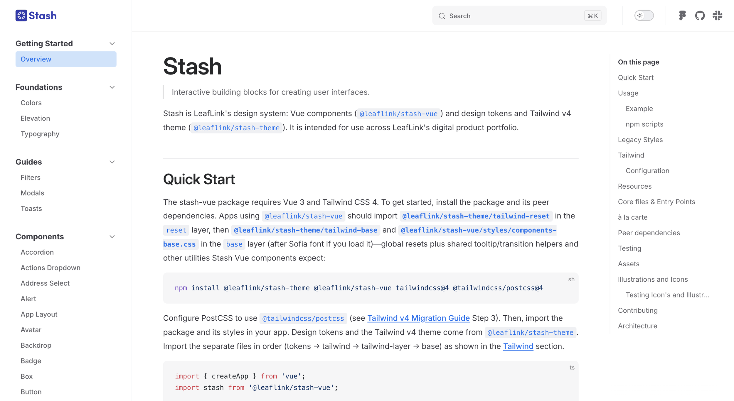
LeafLink’s Stash Design System
Stash is the design system behind LeafLink, the largest B2B cannabis marketplace in the U.S. I led it for four and a half years. I joined as a Senior Designer in late 2021 to audit a fragmented system, grew into Staff to scale it, and capped off as Principal before leaving in early 2026.The arc was turning Stash from something maintained into infrastructure the whole org wanted to build on. The biggest single win was the Filters redesign, which doubled engagement and pushed action rate from under 10% to 20%. Other major shipped work: a new 169-icon system on a 24x24 grid, the consolidation of every legacy calendar variant into one component, and a storybook cleanup from 89 scattered components across two repos to 54 in one.
Stash is live and browsable at stash.leaflink.com.
Client: LeafLink
Role: Principal Product Designer, Design Systems
Year: November 2021 – March 2026
Walking into LeafLink
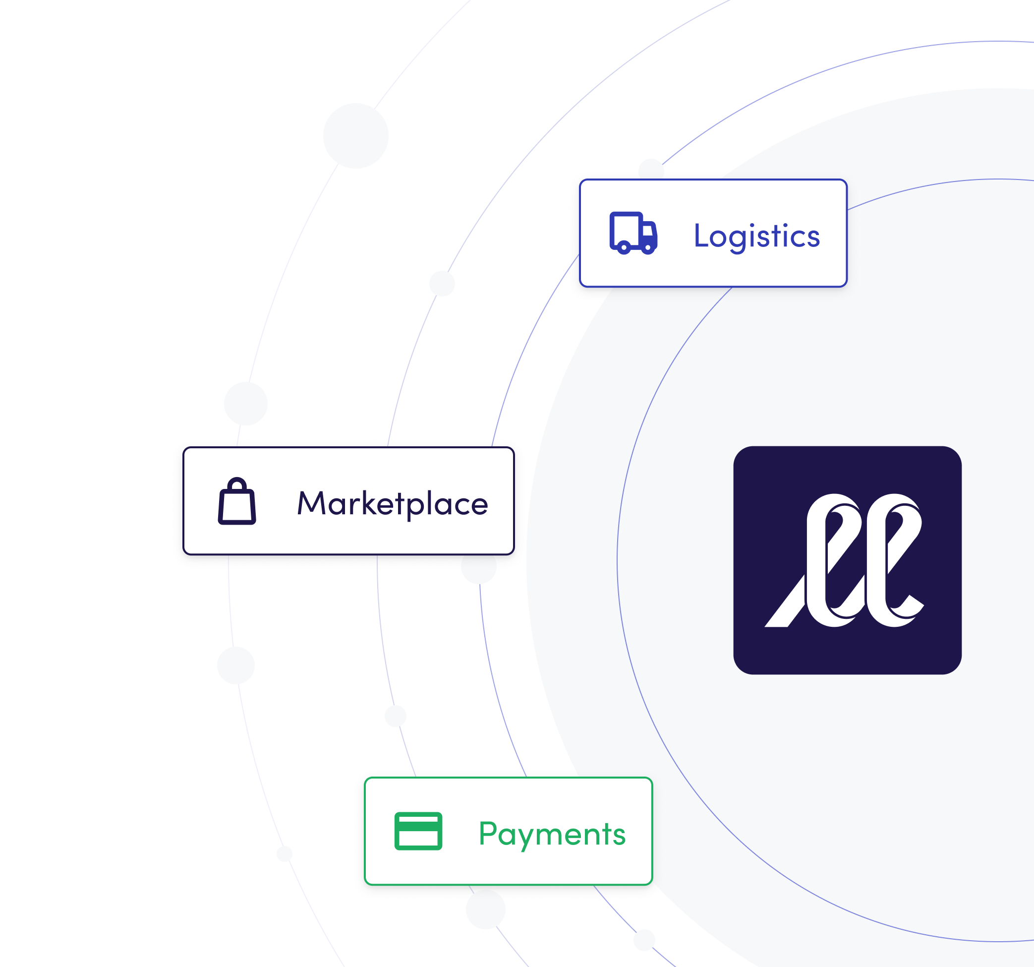
LeafLink ran roughly 45% of the national wholesale cannabis market. The business had three main surfaces. Marketplace, Payments, and Logistics. Each operating as its own silo of pods with its own pace and its own pile of UI debt.
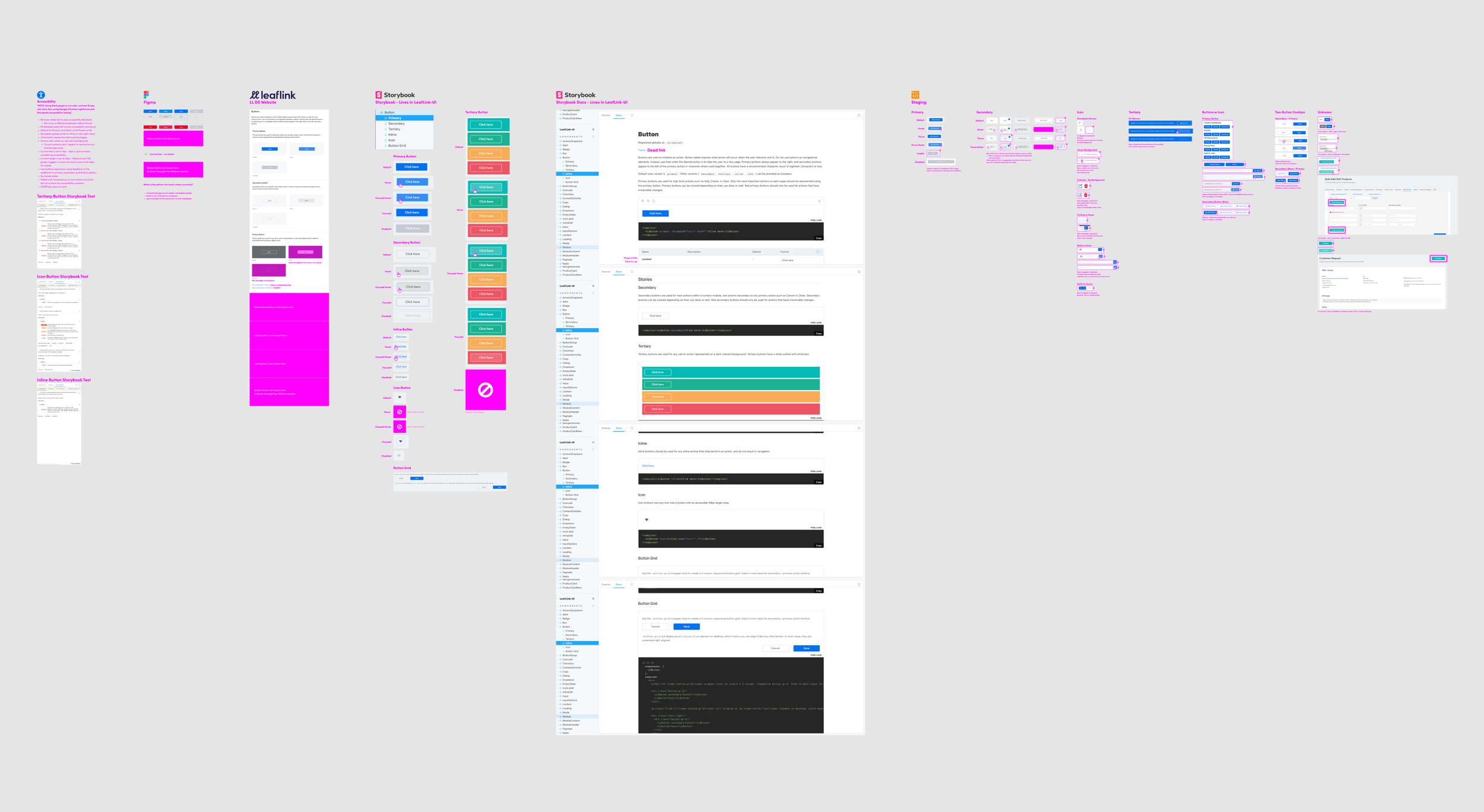
Figma and Storybook were out of sync. Two separate Storybooks (Marketplace and Payments) with overlapping, inconsistently-named, duplicated components. A standalone DS website disconnected from Storybook entirely. And a product carrying layers of legacy components from every era of the system, none of them fully retired.
I started the audit with Button. Mapped it across Figma, both Storybooks, the DS website, and production, and checked accessibility at each stop. One component, many implementations, no shared truth.
The brief for the role was cleanup, evolve, and maintain. It assumed the system was already load-bearing. It wasn't. The first job wasn't design. It was proving how deep the debt actually ran.
The audit
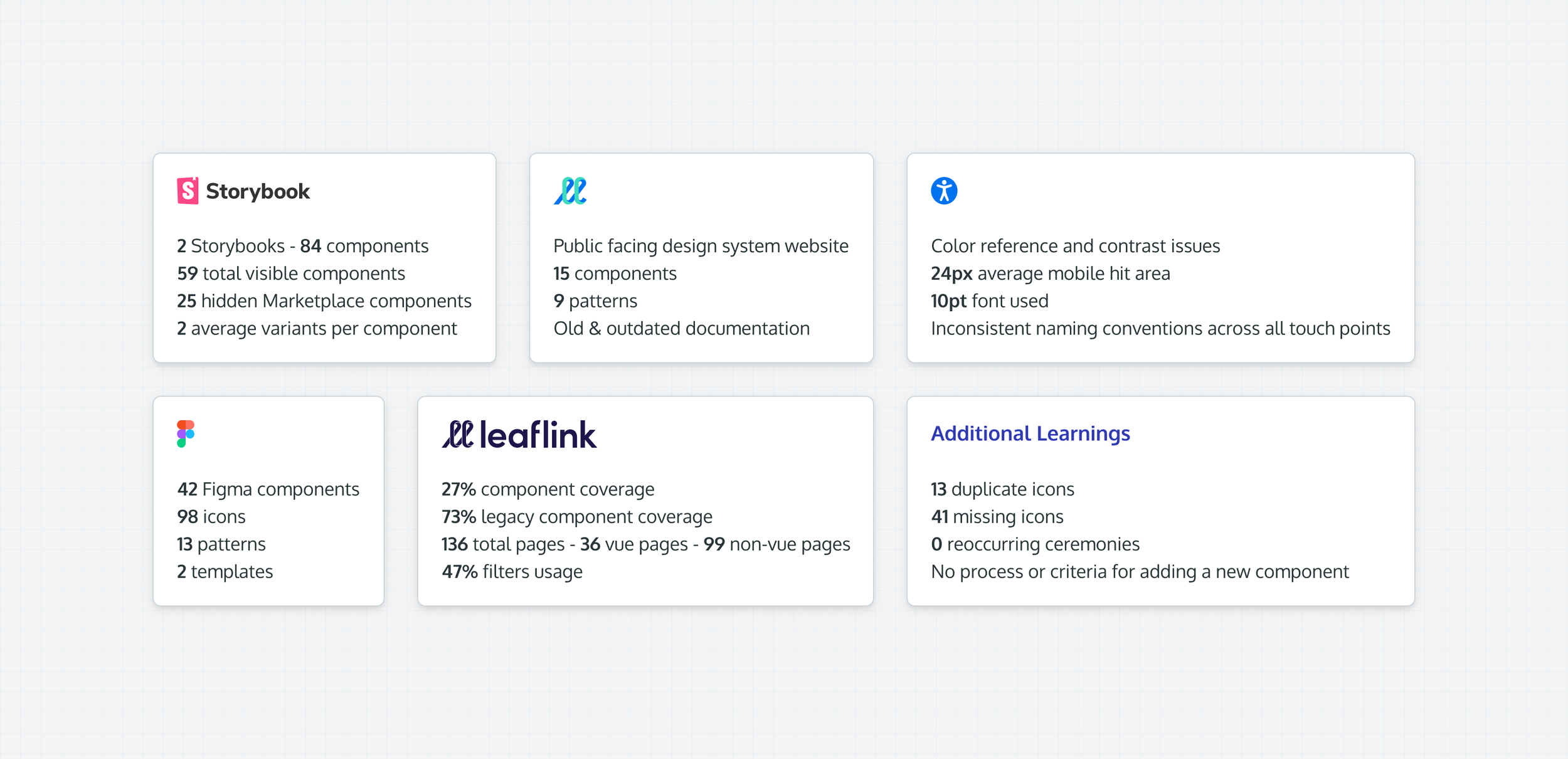
I spent my first three months talking to everyone who touched the system: 8 front-end engineers, 3 engineering managers, 6 designers, 4 product managers, plus 15 user interviews across the platform. Then I audited all 84 components across four surfaces: Figma, both Storybooks, the public-facing DS website, and live production.
The numbers weren't good. 27% of the product was built on system components; the other 73% was legacy. Filter usage sat at 47%. Average mobile hit areas were 24px, well below the 44×44 accessibility guideline. 13 duplicate icons in Figma, 41 icons missing entirely. No process for adding new components. Zero recurring ceremonies across the team.
I presented the findings at the monthly all-hands with a proposed roadmap and data-team-backed KPIs: name the system, hit 50% component coverage, Vueify 20 pages, consolidate to one Storybook, document every pattern, establish a process for evolving the system, and raise filter usage by 15%. The presentation landed. It opened the door to the next year of work.
Naming Stash, and building a team without a team
The system needed a name. LL DS, the design system, the DS. Nothing the org could rally around. We workshopped options with the design team and landed on Stash. Cannabis-adjacent without being on-the-nose, easy to say in a standup, and it gave the system a brand it didn't have before.
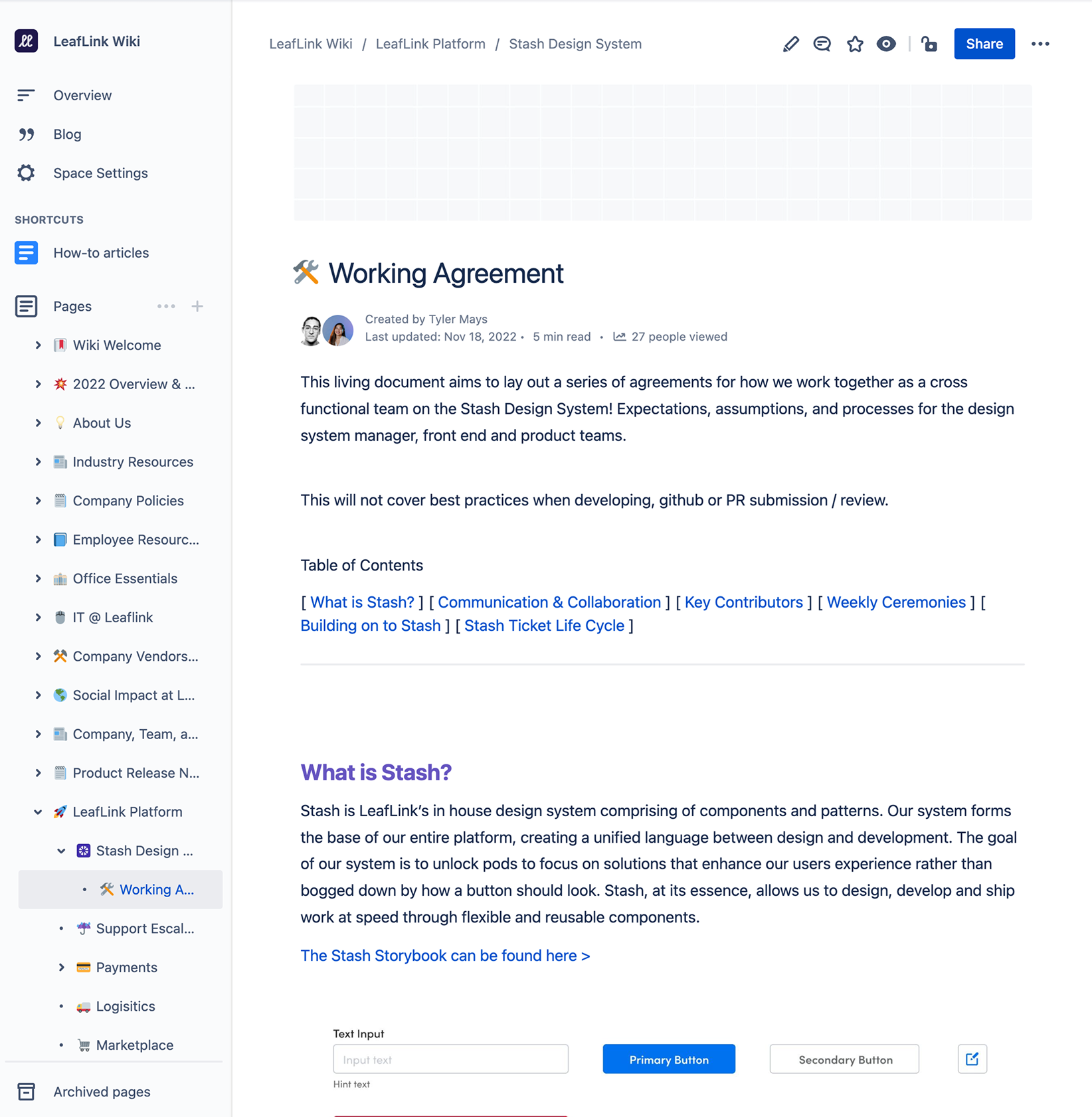
Stash was never a formal pod. It was a self-organized group of engineers, designers, and PMs who opted in. So building a working culture was the actual product. We set up three weekly ceremonies, a Working Agreement in Confluence with a clear intake process and a five-question component rubric, and a Jira project where any pod could drop a proposal. The load-bearing win: a standing 10% of every sprint, across every pod, dedicated to Stash work.
The honest version: getting bandwidth for larger projects was a constant fight. Without dedicated headcount, every initiative had to be sold to product leadership or smuggled into a pod's roadmap. The ceremonies and the 10% rule were the scaffolding that kept the work coherent across surfaces that weren't required to care.
Storybook cleanup
Before anything else could be rebuilt, the Storybooks had to be merged. We had two: Marketplace and Payments, with 89 components between them, overlapping names, and a separate public-facing DS website that was out of sync with both. We consolidated them into one, using the cleaner Payments codebase as the foundation, and renamed it Stash.
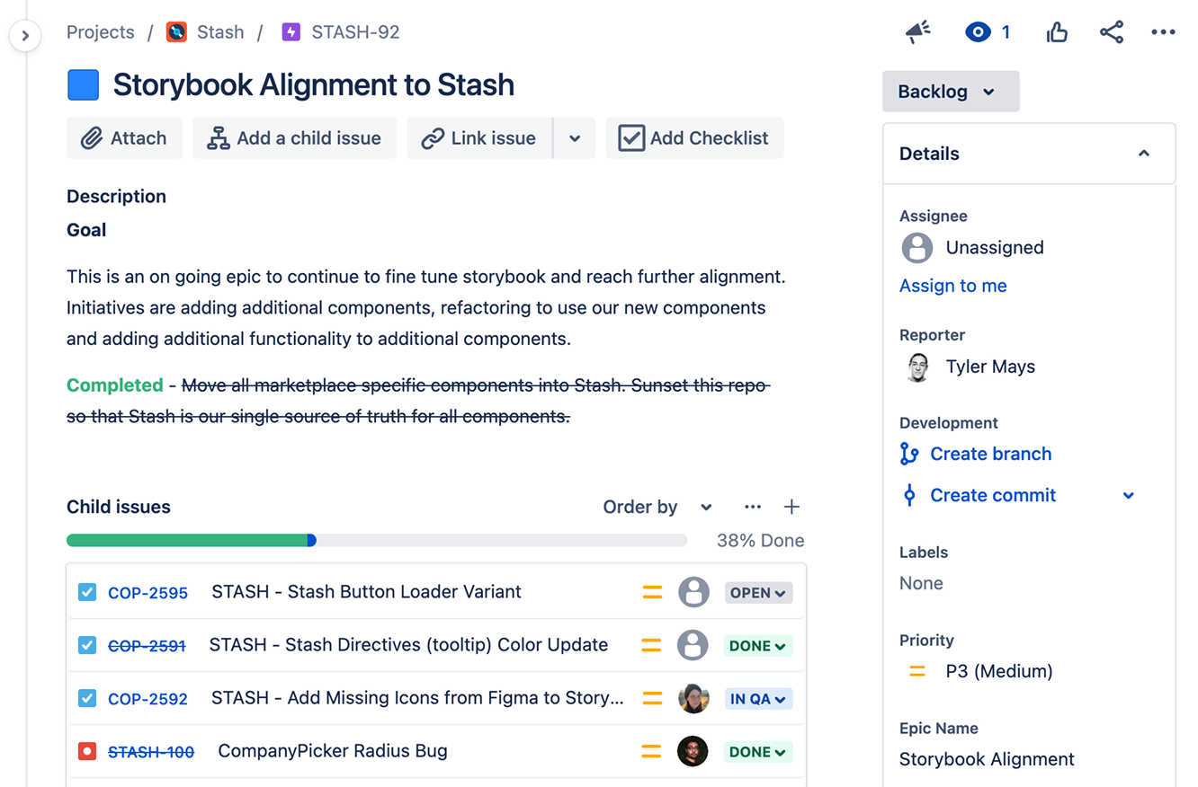
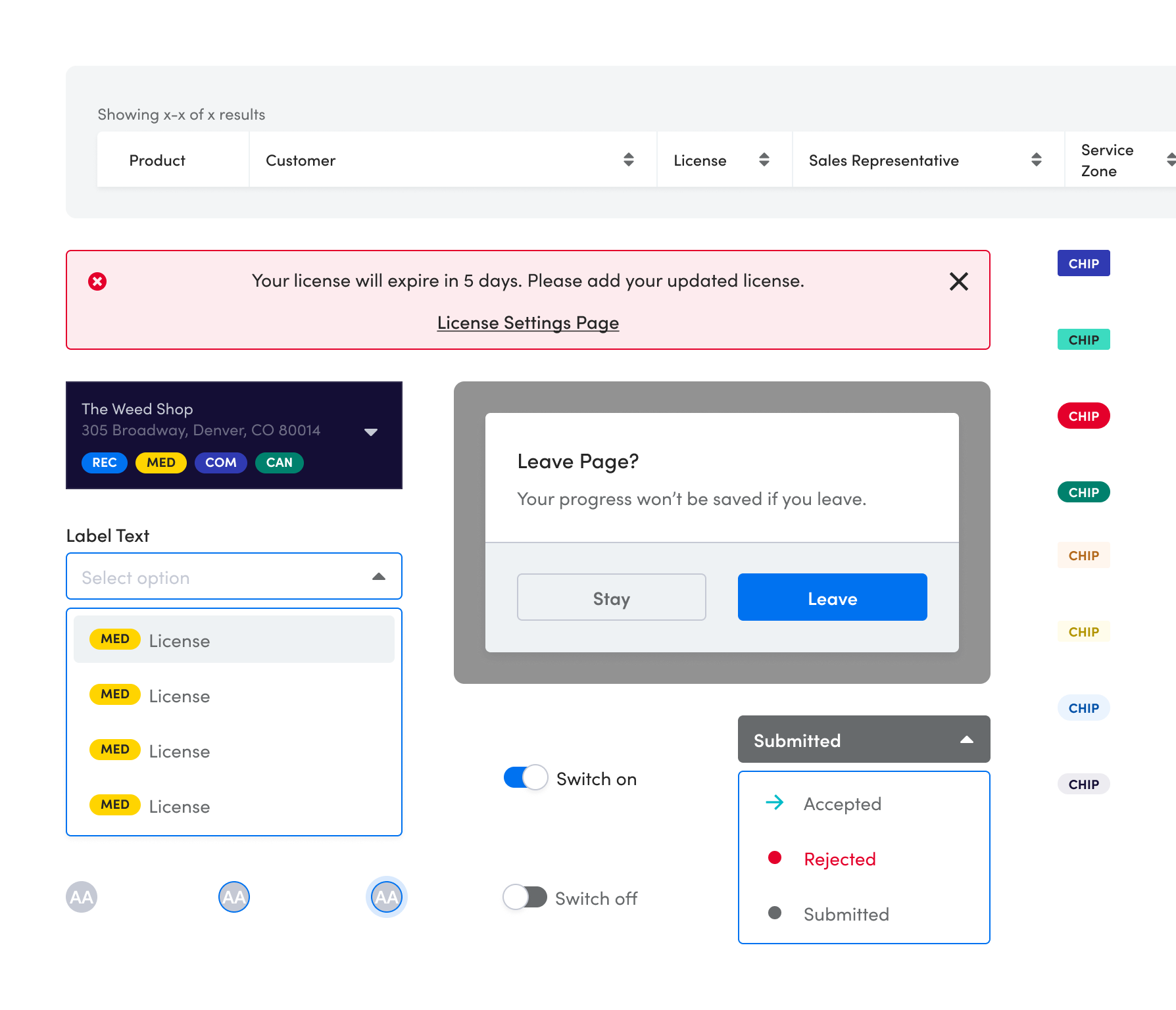
The consolidation let us make overdue fixes to the library. Banner and Alert collapsed into one component with props for styling. Tag got swapped for a rebuilt Chip, which became the base for notification badges, license indicators, and order status. Tables broke down into Header, Cell, and Row primitives so pods could compose what they needed instead of forking the whole component. Avatar, Switch, and Dialog joined the system for the first time.
89 components down to 54.
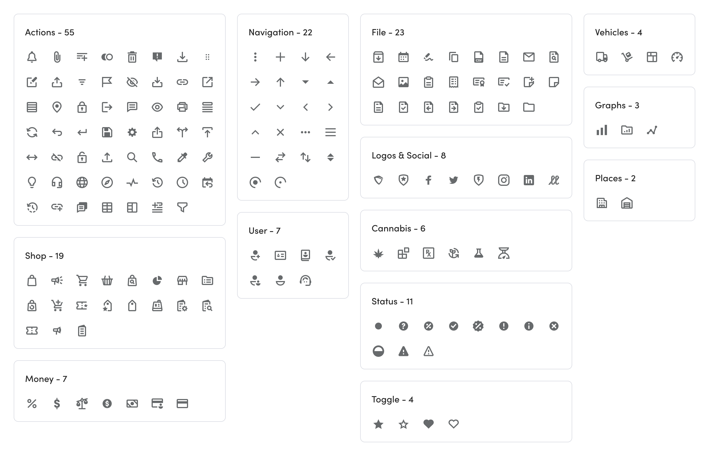
A new icon set
The icon library had three problems: inconsistent naming (conventions described what icons did, not what they were), clashing styles across the set, and strokes too thin to stay legible at small sizes.
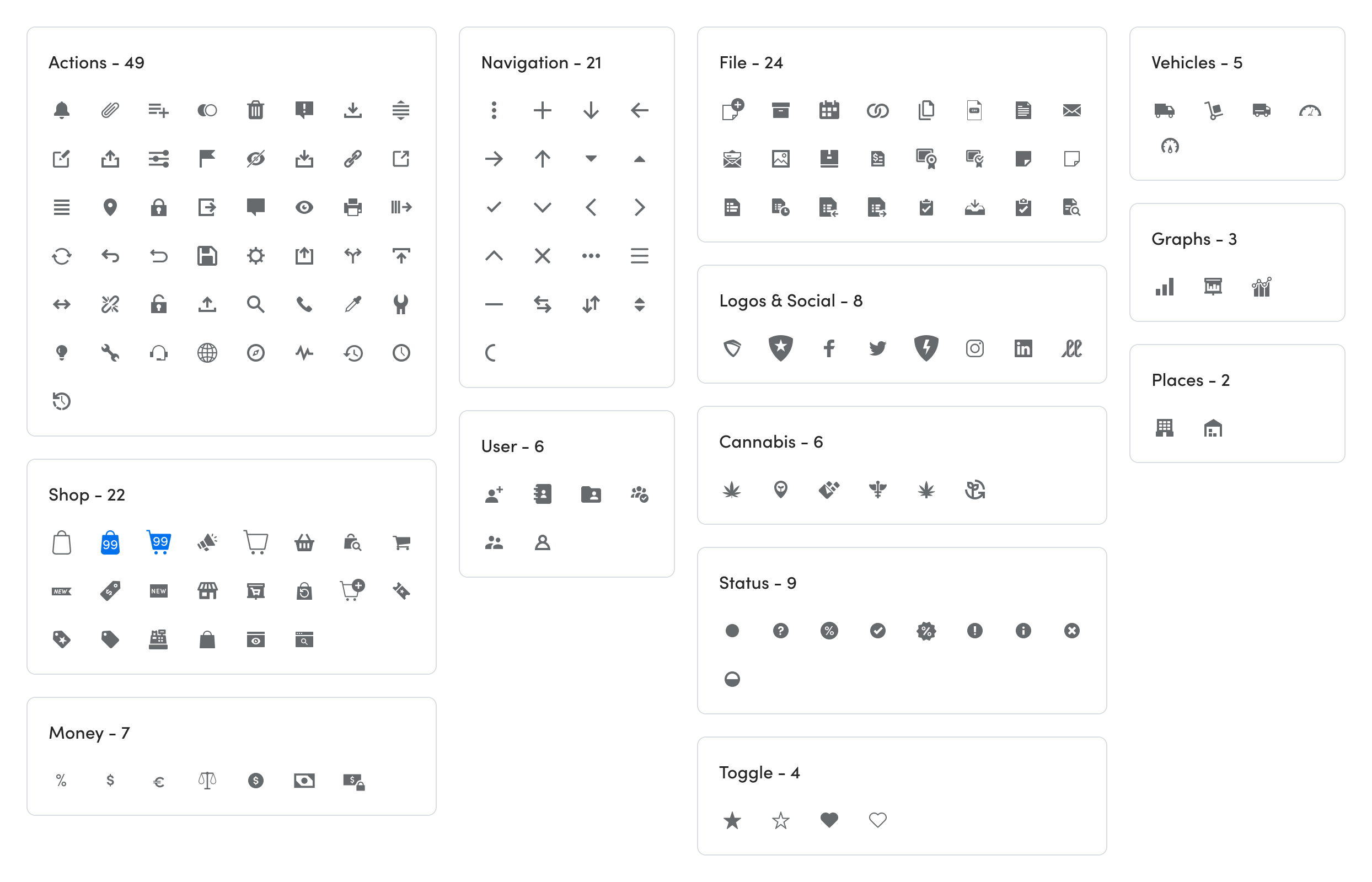
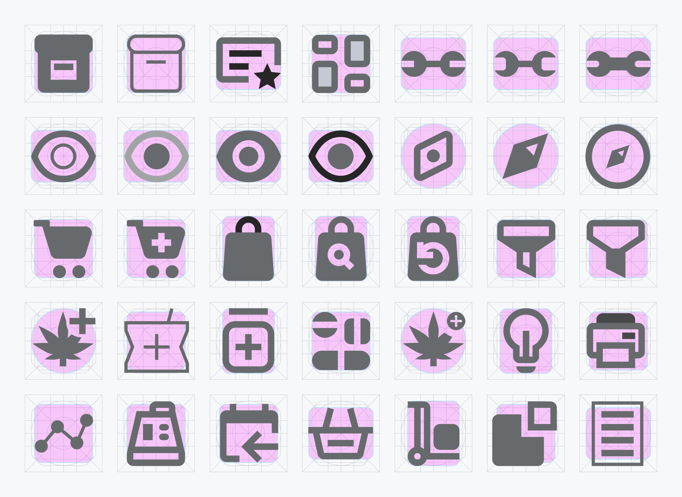
We built a new set on a 24×24 grid with 2px strokes and 2px radii, plus keyline grids for circular, square, vertical, and horizontal icons so anyone on the team could contribute a new one that fit. The rebuild: 166 icons became 169. 16 new, 13 removed, 89 renamed. Naming convention shifted from action to identity. One pencil icon serves edit, draft, and compose screens without needing three names in Figma.
Once the grid was established, we ran style explorations against it. We tested stroke weights, filled versus outlined, geometric versus softened, then locked the final direction.
One calendar to rule them all
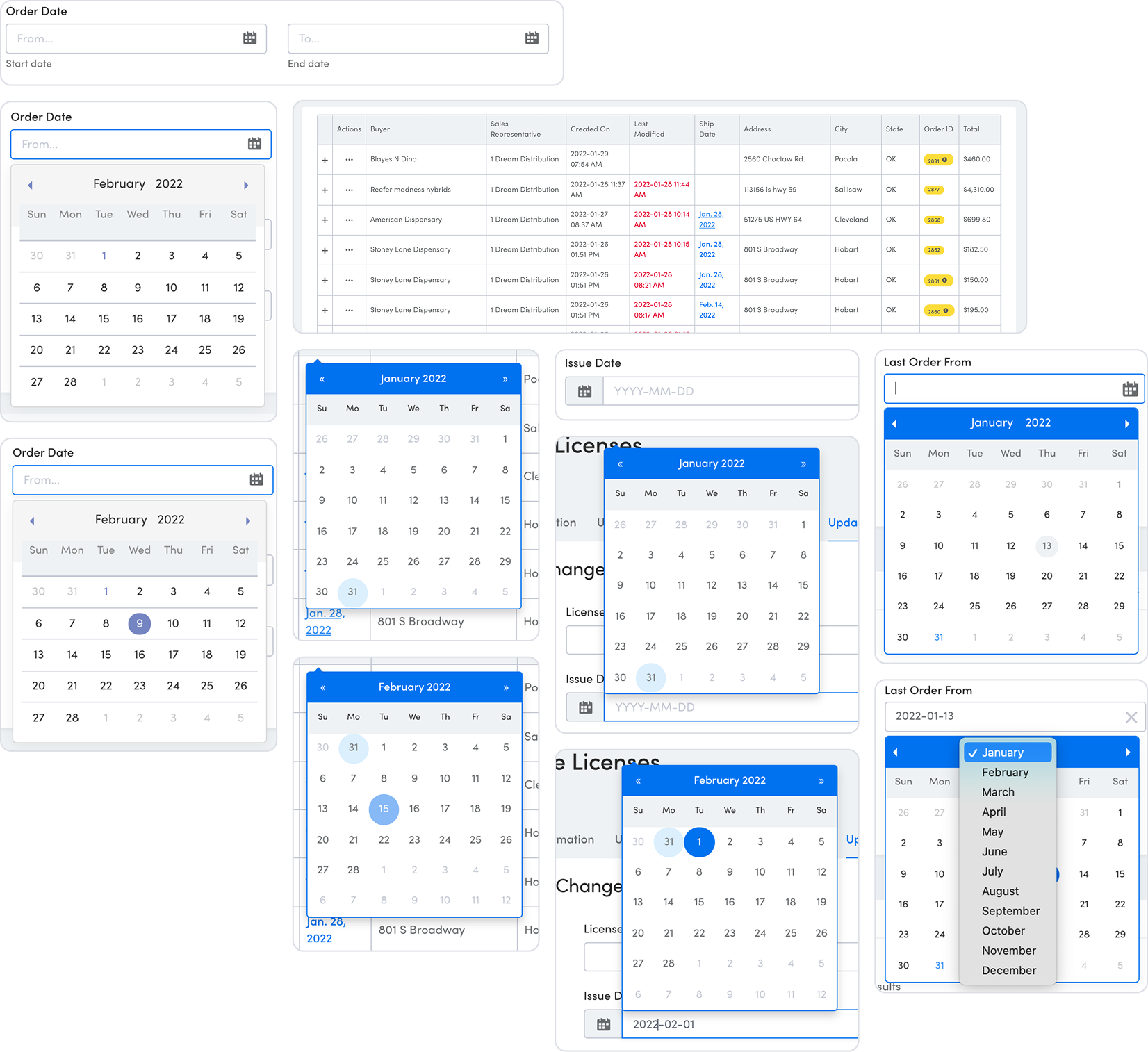
The Date, Calendar, and Date Range Picker was the messiest component in the system. Multiple third-party libraries in use across the product, several no longer maintained, styling that fought itself across surfaces, and accessibility gaps that hit hardest on mobile. Payments and logistics teams were especially blocked. Users complained about the time it took to set up recurring deliveries and payments.
We ran style and functionality studies against the core use cases: clearing ranges, applying ranges, jumping to today, and quickly navigating between months and years.
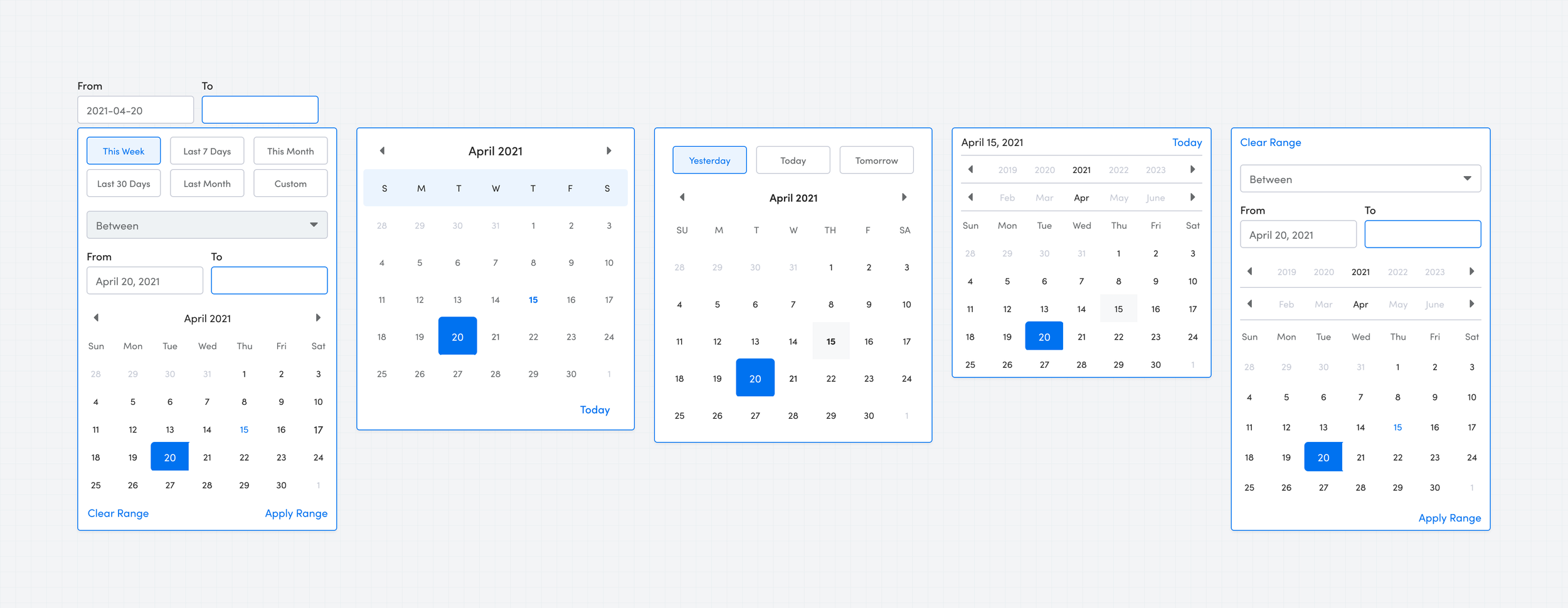
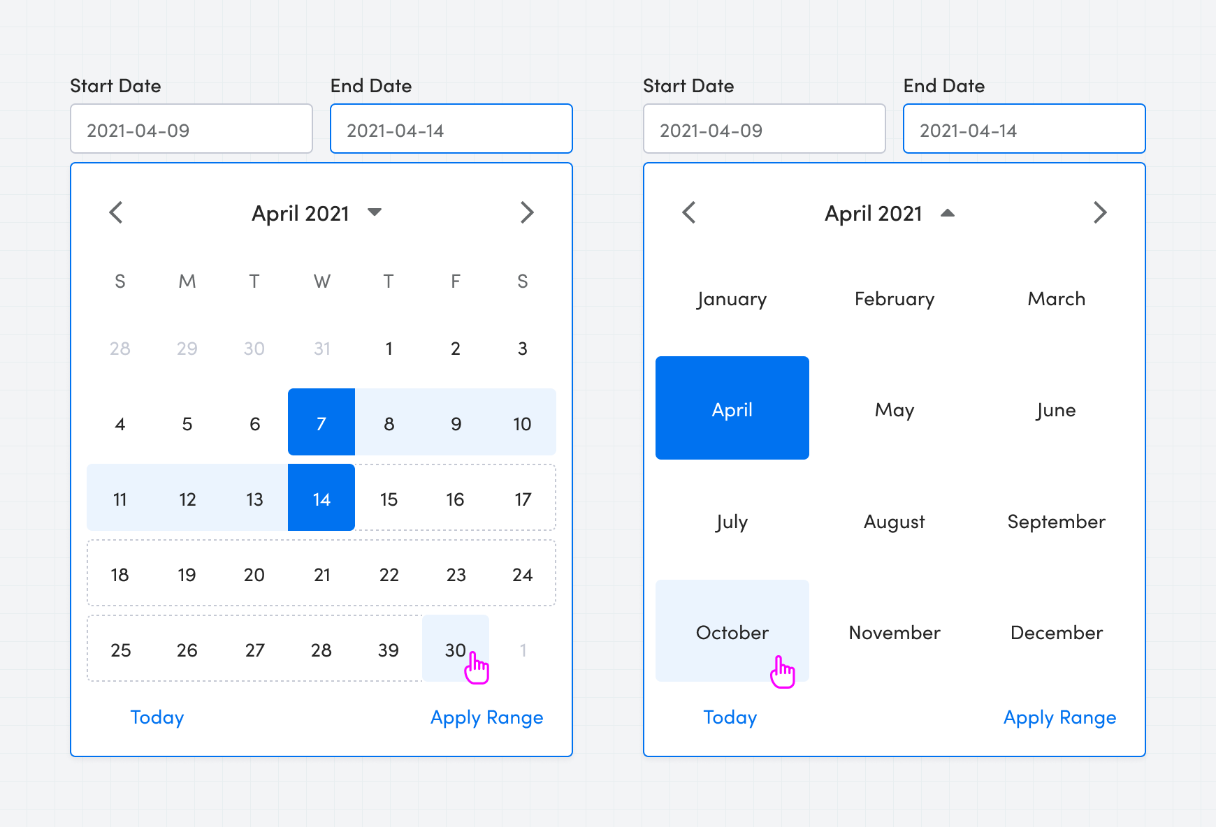
For MVP we cut the quick-action functionality and the year/month switcher to focus the work on the range selection experience. Hit areas got bumped up and text got larger for accessibility. One decision worth naming: our mobile audience was roughly 2% of total usage, so rather than build a custom mobile range picker, we leaned on the operating system's native date picker. It wasn't glamorous, but it was the right call for where the product actually lived.
Post-launch, pods worked through tech debt to remove the remaining legacy variants from production.
Improving the filters pattern
Filters were the most-used, least-loved pattern in the product. Usage sat at 47% across the platform and action rate hovered below 10%. That meant more than half the users who opened a filter left without applying it. Working with the data team, we scoped three systemic failures: filters were hard to discover, they broke page layouts when applied (especially on mobile), and they were built directly into tables, which meant every engineering pod had to rebuild them from scratch.
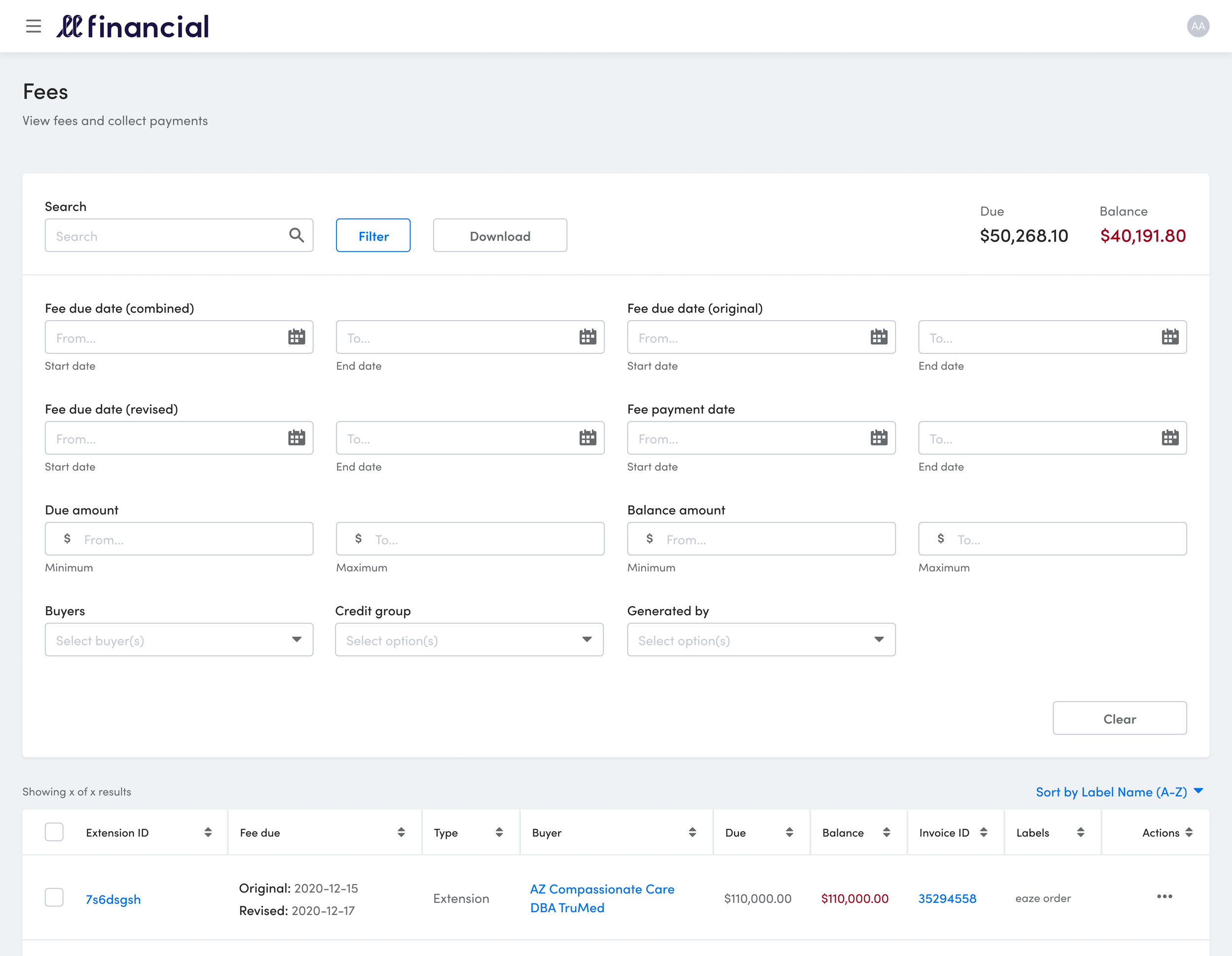
We ran heuristic research against Ikea, Target, Amazon, Walmart, and Airbnb. These were the marketplaces solving this pattern at the scale we needed. What came back was a bucketed approach: grouped options exposed at the top level, secondary options tucked behind them, filter state persistent across views. We rebuilt the pattern as a standalone component instead of a table-bound one, so pods could drop it in anywhere.
Rather than roll out platform-wide, we partnered with the logistics pod first. They had some of the most complex filter logic in the product, so if the pattern held up there, it would hold up anywhere. The pilot let us tune the component against real use before asking other pods to adopt it.
The original goal was a 5% improvement in action rate. We shipped a 100% increase in engagement and pushed action rate from under 10% to 20%. Four times the target. Post-launch, desktop users gravitated to the filter drawer as much as mobile users did, and two new asks surfaced quickly: saved filter sets and real-time updates without an apply step. Both went into the roadmap for v2.


What slowed us down, and what lived on
The years I ran Stash were hard years for the business. A looming recession pushed the company through multiple rounds of layoffs, cannabis spending and investor funding pulled back across the industry, and a hiring freeze meant I couldn't bring on the counterpart the roadmap had assumed. Shifting priorities pulled me into pod work I hadn't planned for, which meant Stash initiatives moved slower than I wanted.
The roadmap shortfall I think about most: we'd committed to Vueifying 20 pages across the platform. We shipped 10. The work that got done was the right work. Foundation components, the filter pattern, the icons, the calendar. But the migration moved at half the pace I'd pitched to leadership.
Running a system without dedicated headcount during a downturn meant every initiative had to be sold, not just designed. I got better at selling.
I left LeafLink in March 2026. Stash is still there. 54 components in a single Storybook, 65% coverage across the product, above the 50% goal we'd set at the start. Filters v2 and Icons v2 shipped, documentation living in both Figma and the VitePress site the team built after I'd left. The site is live at stash.leaflink.com. The foundations we laid in the first two years were sound enough that the team kept extending them without me.
Four and a half years on a single system taught me that design systems succeed when nobody talks about them.