
Inturn’s Flatiron Design System
In 2019, Inturn was at an inflection point. The engineering team was rebuilding the platform for a "NextGen" launch, but the design system hadn't kept pace. Accessibility scored 53%, components were duplicating themselves, and old code was bogging down everything we touched. Throughout 2020 and into 2021, we rebuilt it from the ground up.
By the time we shipped in March 2021, we'd cut the system from 112 components down to 59, deleted 47,517 lines of code, removed dependencies on 7 third-party design systems, and pushed accessibility from 53% to 93%. We named it Flatiron, after the NYC neighborhood where we'd worked together before COVID scattered us.
Inturn was acquired by Mad Street Den in November 2022.
Client: Inturn
Role: Senior Product Designer & Design Systems Manager
Year: March 2020 – April 2021
A joint workshop with Marketing
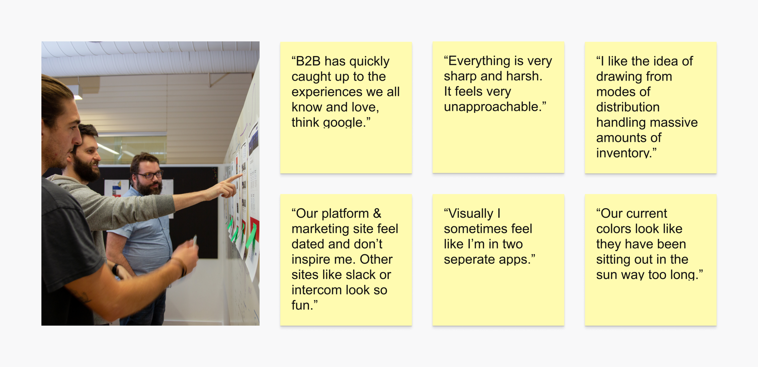
When we started scoping the rebuild, the marketing team was in parallel rethinking the brand and the marketing site. We proposed a joint workshop to get aligned before either team got too far down its own path. The goal was to surface internal sentiment about the brand at every level of the org and feed that into both the system rebuild and the marketing site redesign.
We ran the session through a few standard design-thinking exercises: Assumptions and Questions, Feedback Grid, Hopes and Fears. The output gave both teams a shared direction, and the visual research fed straight into the brief for the external agency working on the marketing site.
Not so Dank
Dank, our legacy design system, had glaring problems. Color contrast issues, type that didn't scale, mobile usability gaps. We ran the platform through Lighthouse and Stark and scored 53% on accessibility, well below where we needed to be. A full audit of all 112 components turned up what we expected: duplicate components, one-off customizations, and a lot of old code we could just delete.
We took the audit to leadership and got the green light to rebuild. In parallel, the design team migrated off our patchwork of Sketch, Abstract, and Invision and consolidated onto Figma. One tool, closed loop.
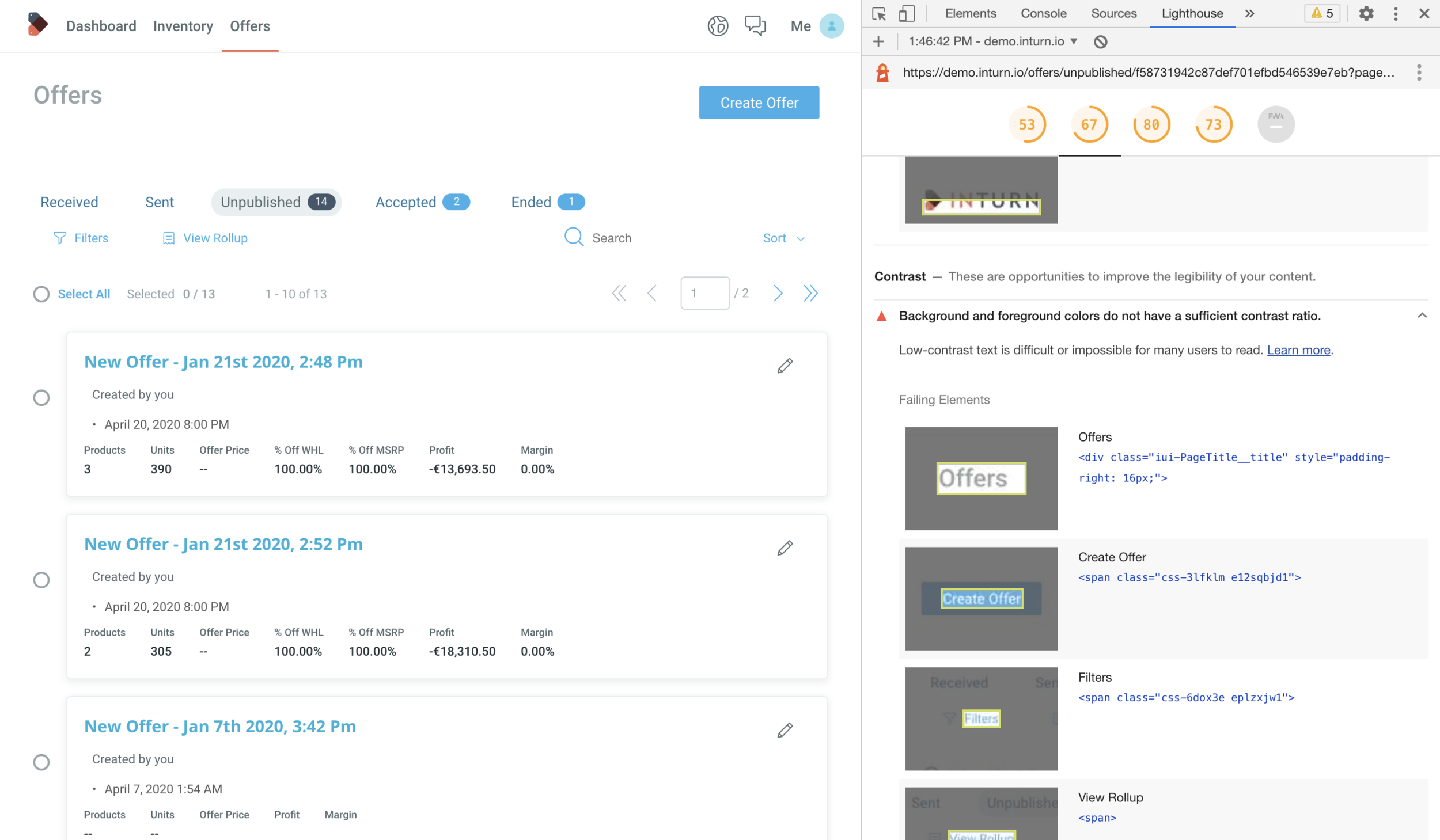
Accessibility: 53%
Principles
Before any pixels moved, we wrote down four principles to anchor the rebuild:
Design in the open. Document everything, including the small decisions, so anyone in the org can understand what got chosen and why.
Design to be simple. Utilitarian and easy to replicate. Anyone, at any level of design, should be able to jump in and use the components.
Design to be replaced. Systems should outlive any single designer's tenure. That means documentation down to the corner radius.
Design to communicate. Close the gap between dev and design naming conventions. Merge glossaries so engineering and design speak the same language.
Exploring directions
For color, we pulled inspiration from mass inventory. Shipping containers, freight trains. Building palettes that felt grounded in Inturn's actual industry. On type, we explored a full refresh but after working through the cost with our devs and a few type foundries, decided to keep Roboto and refine the typographic hierarchy instead of paying for a wholesale swap. Alongside the color and type work we built three mood boards: people, abstract and environmental, and illustration. We shared everything with the external agency to keep our work and theirs in lockstep.
We landed on Direction 3, but treated it as a guide rather than a prescription. Each component would get a chance to be refined further as we built.
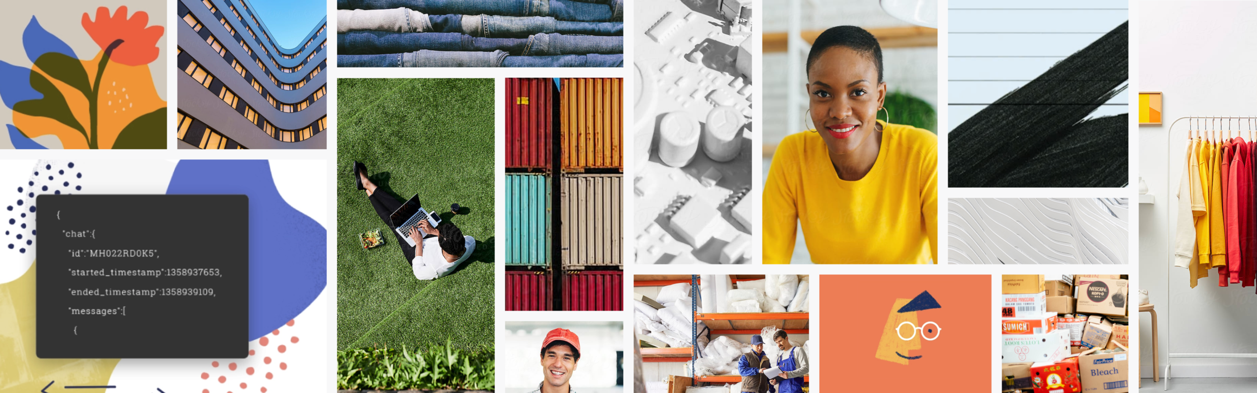
Mood board sources
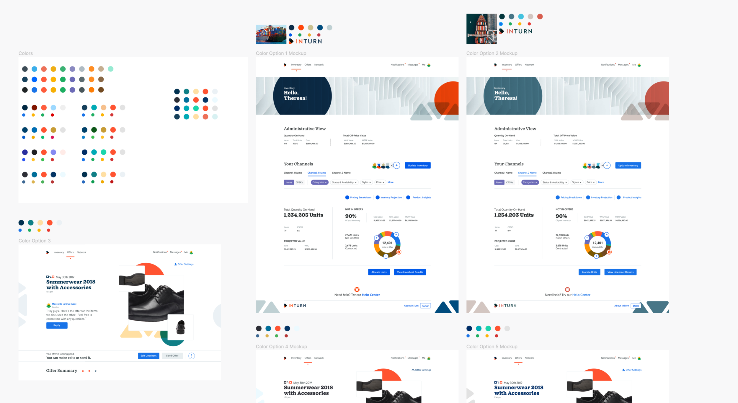
Color Studies
Direction 1 — current colors enhanced.

Direction 2 — accessibility-compliant, new type.
Direction 3 — where we landed.
Getting Flatiron off the ground
Right as we were ready to build, things got harder. Our head of product left. Storybook was badly out of date. COVID hit in the middle of a major reorg into pod teams. Orry took on the Storybook upgrade. I took on the PM work: setting up Jira, writing stories, and cutting paired design and dev tickets for each component.
For reference we kept Material, Polaris, Carbon, and Apple's HIG nearby. Somewhere along the way we realized the system needed a name. Something that captured the energy of working in person, before Zoom flattened everything. We landed on Flatiron, after the NYC neighborhood where we'd worked together pre-COVID.
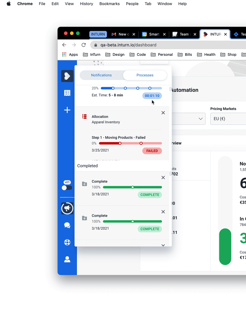
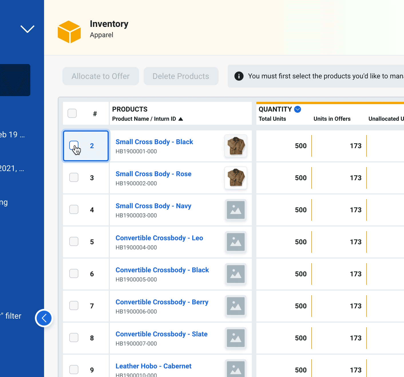
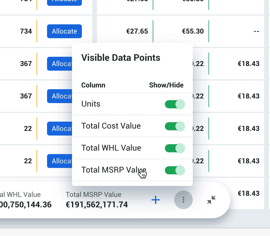
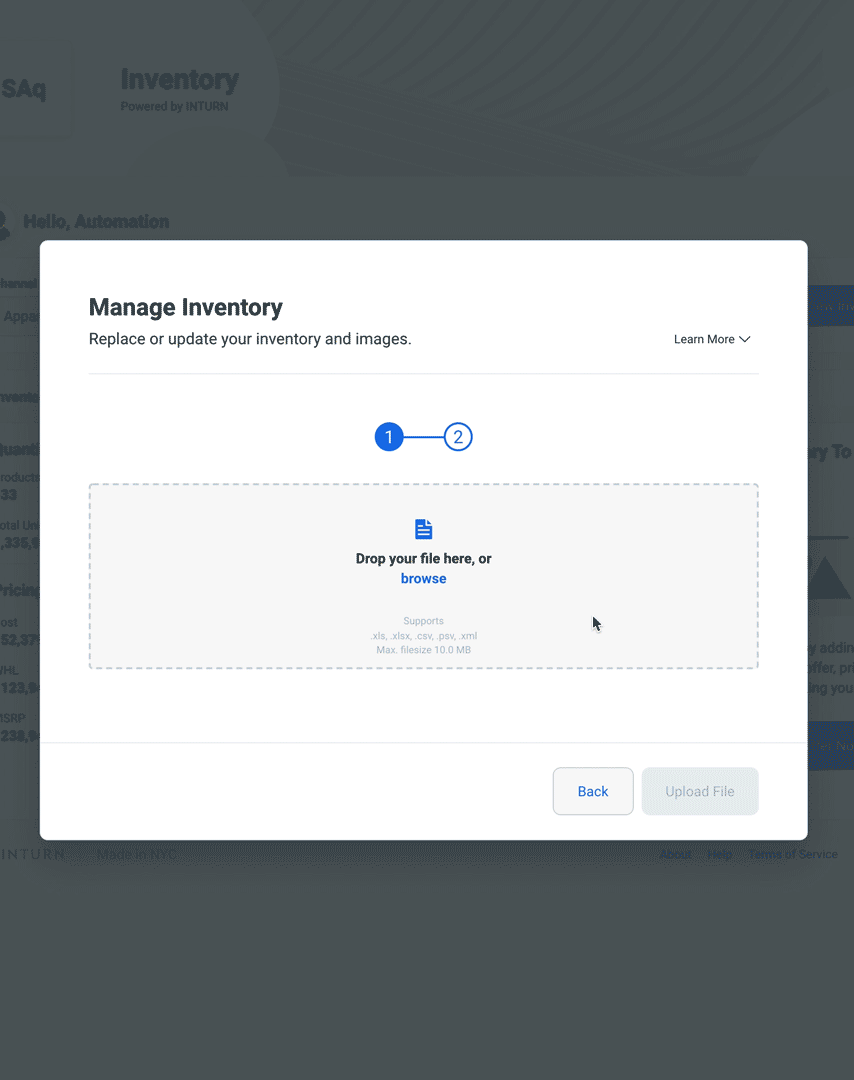
The build took four months of two-week sprints. As components shipped, we used the Figma to Storybook bridge to merge design and code into one source of truth. On March 30th, 2021, we hit 100% Flatiron coverage across the platform, along with the component, code, and accessibility numbers called out up top.
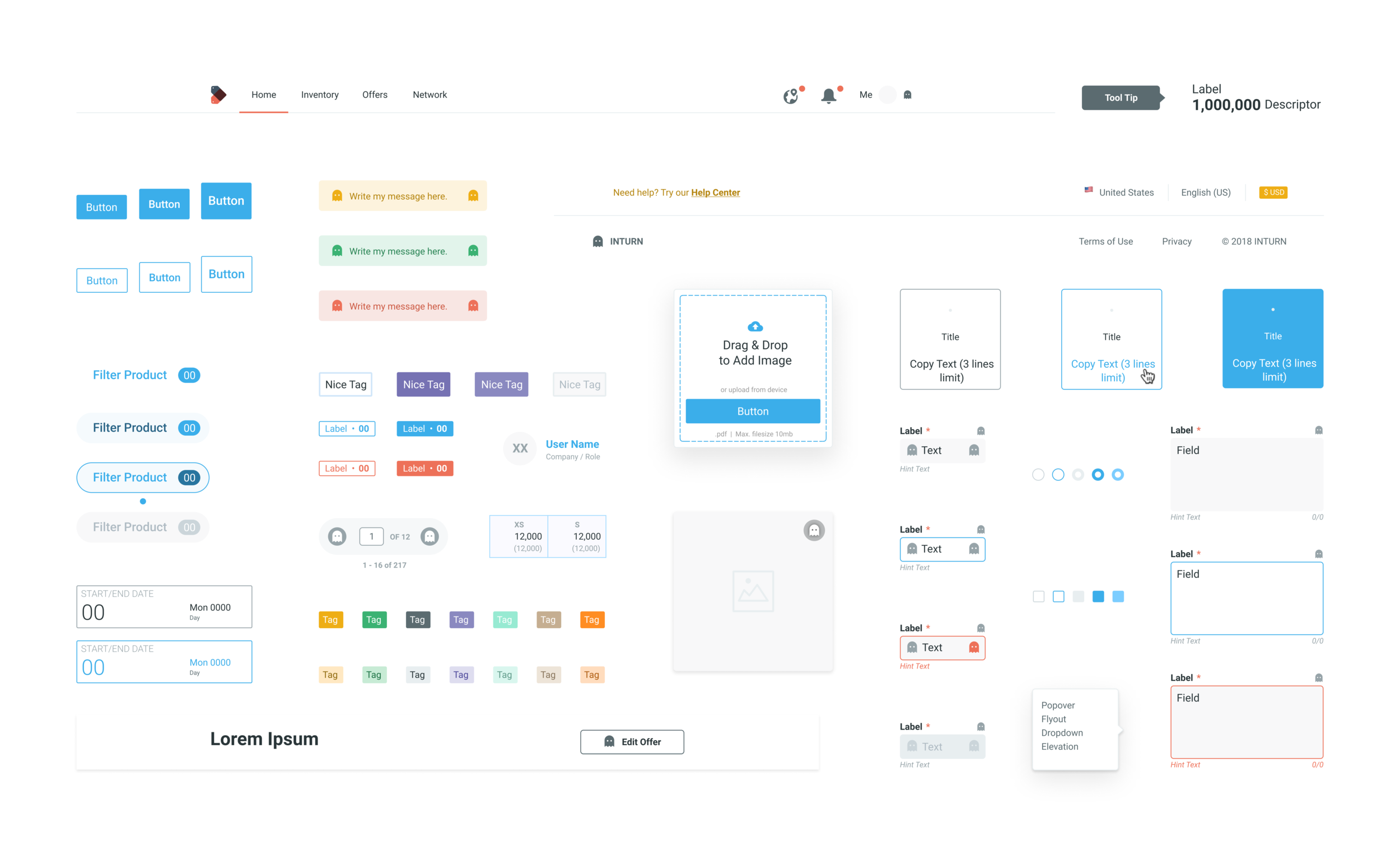
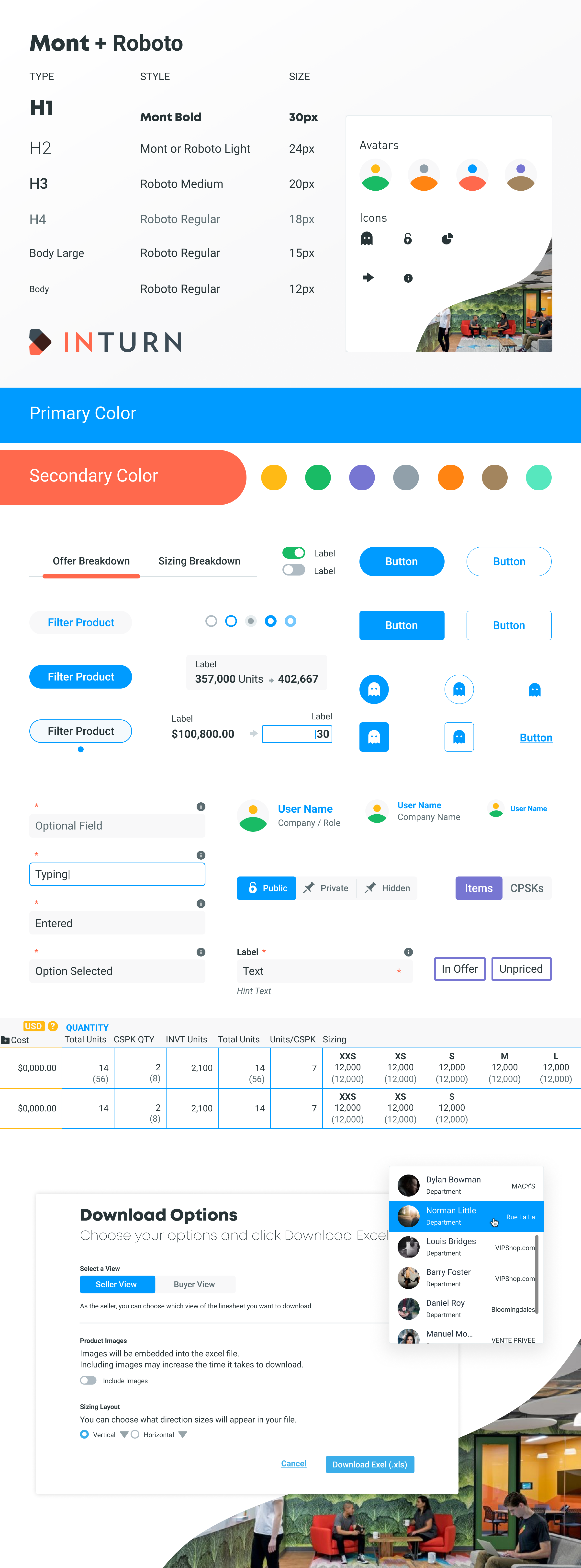
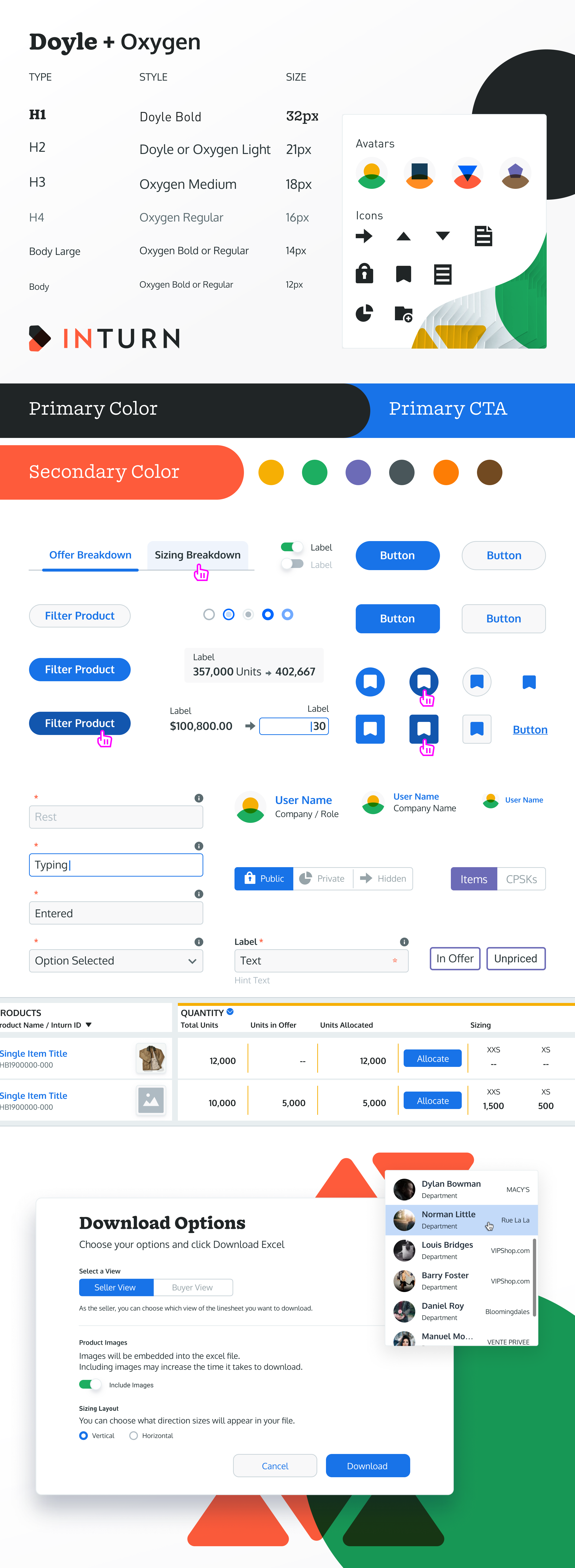
Refined UI studies
Three directions we explored before settling on the final look.
Exploration 1 Notion-inspired floating content blocks, minimal headers
Exploration 2 Slack-inspired headers, Shopify-inspired content boxes, abstract data imagery
Exploration 3 Dark option exploring depth through grey, influenced by IBM Watson and Carbon
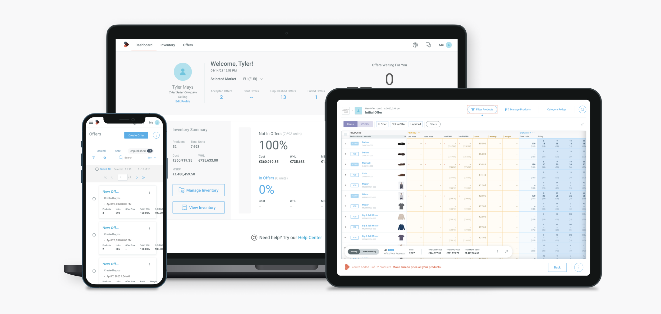
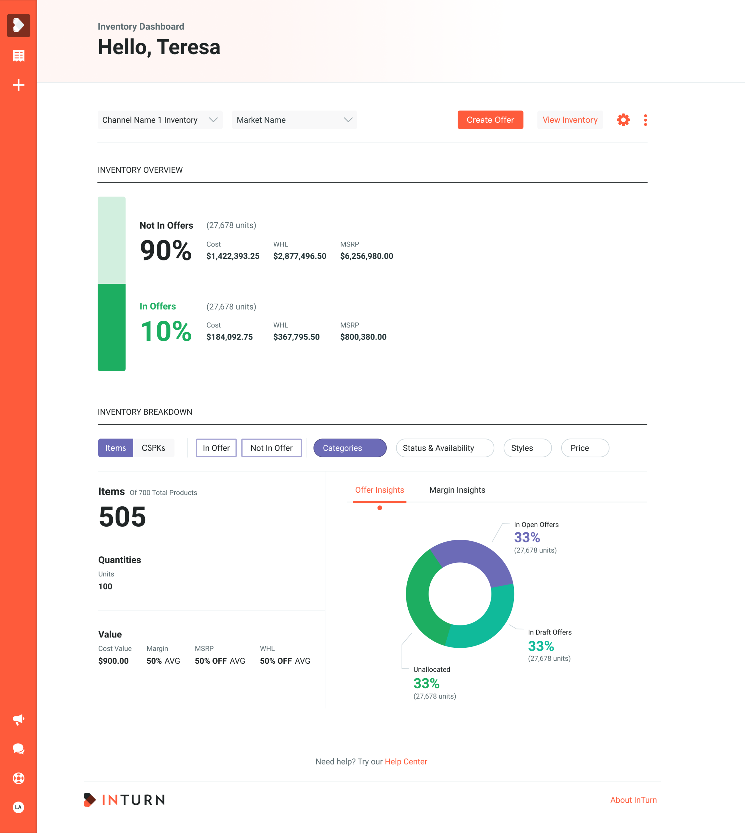
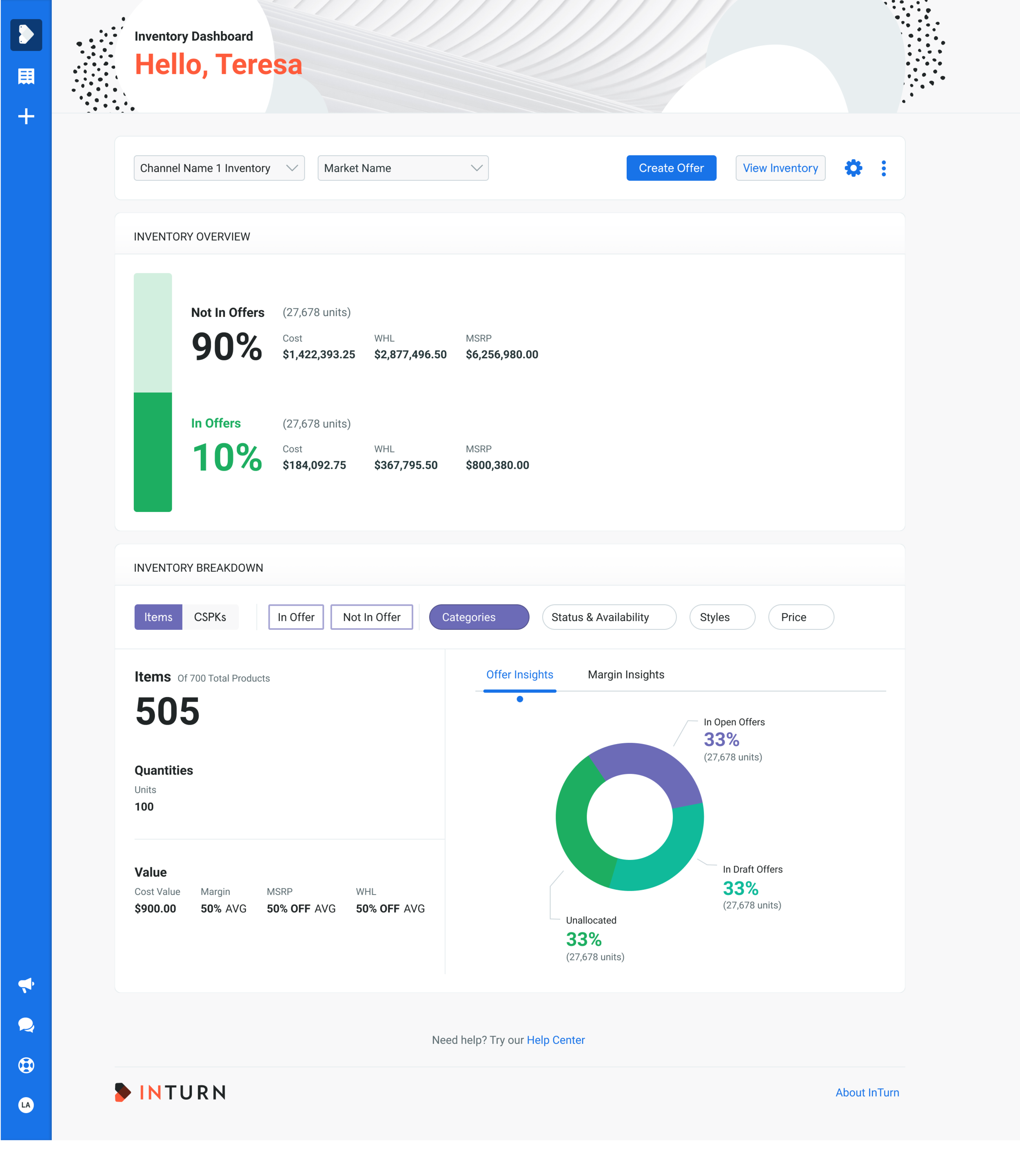
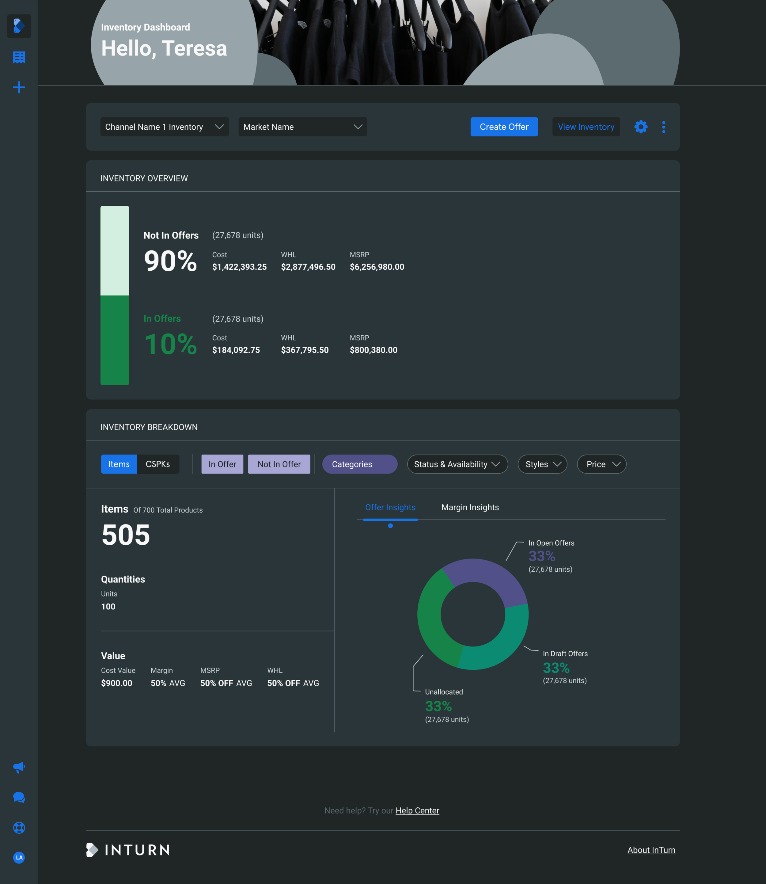
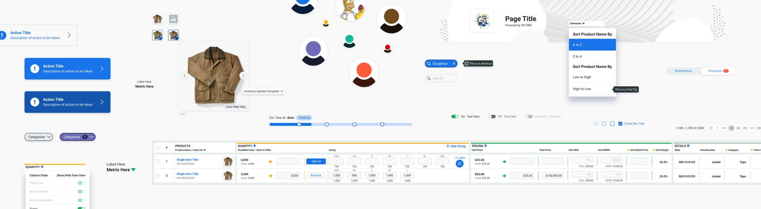
Final design
What Flatiron looks like in production across desktop, tablet, and mobile.
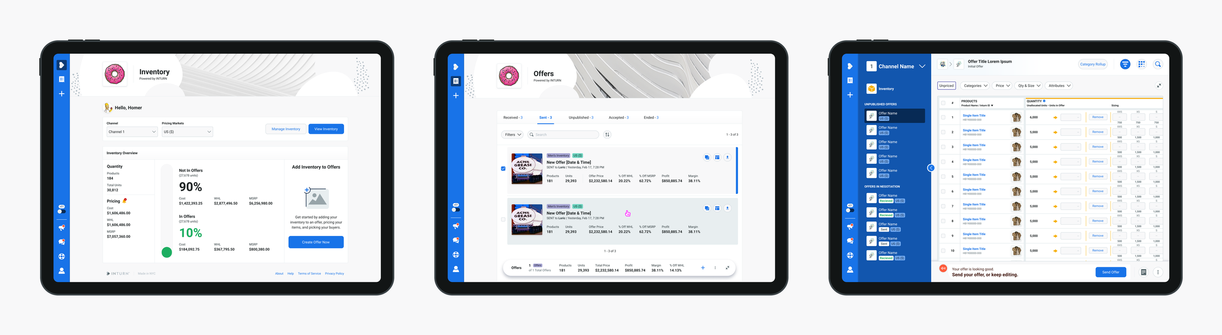
Dashboard, offers, and negotiation linesheet on iPad
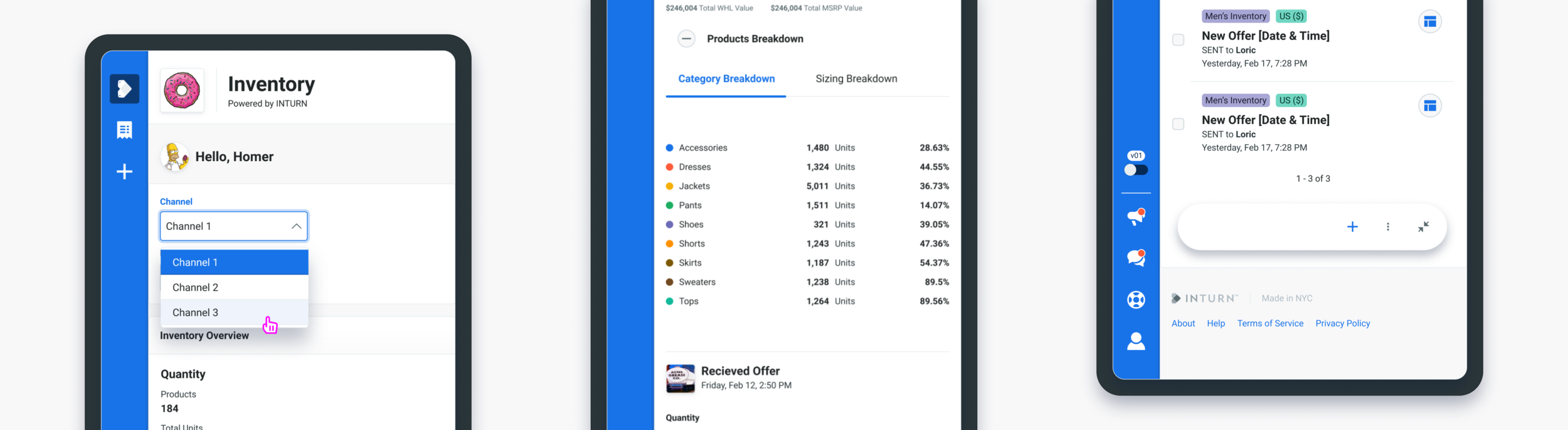
Mobile views Dashboard, offer overview, offers
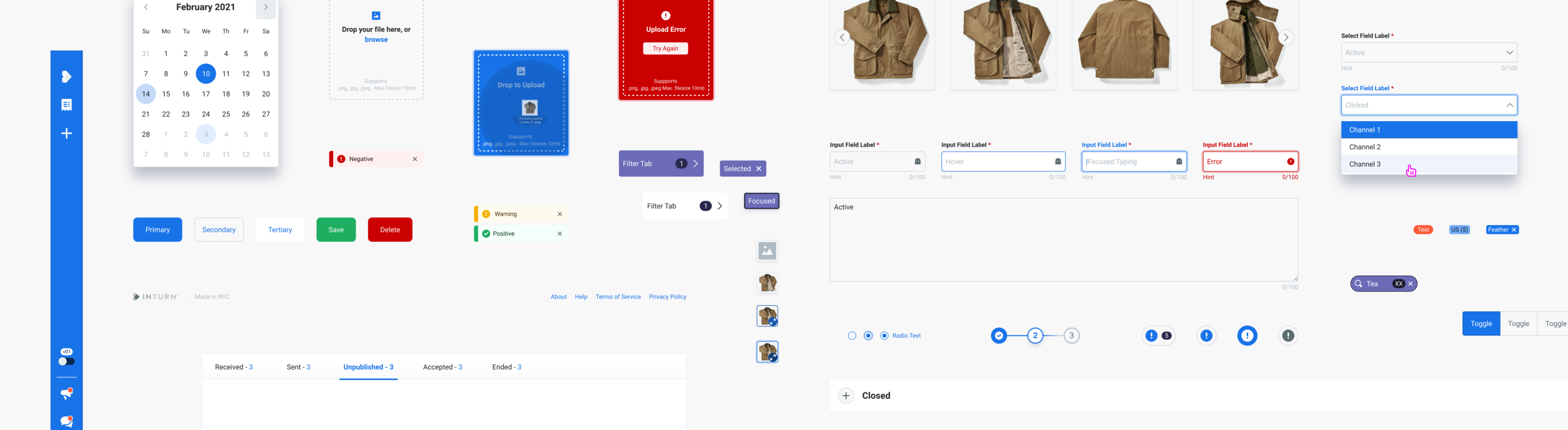
Interaction model and micro-animations
Subtle motion on hover and click states, designed to make the system feel responsive without getting in the way. Prototyped in Figma, Principle, and live code.
Where Flatiron went
Flatiron shipped in April 2021 and carried the platform through Inturn's NextGen launch. In November 2022, Inturn was acquired by Mad Street Den and eventually rebranded as Vue.Ai in late 2024. The system I'd built no longer exists as Flatiron. But the ideas and patterns we committed to then still shape how I think about design systems now.